Buttons
How to Use
You can insert buttons using the block editor. They can be used alongside or within many other blocks.
- Select Add block and choose the Buttons block.
- The Buttons block will start with one button in the default style. You can add more buttons inline with the first by selecting the Add button icon inside the Buttons block. (You can modify their styles independently.)
- Enter the button text by typing directly in the button element.
- Select the Link icon in the block toolbar to enter the URL for the location you want the button to link to.
- The button defaults to the filled style. You can change the style by selecting the block and opening the Styles panel in the block settings sidebar.
Additional Options
You can modify the horizontal alignment of the Buttons block by selecting the alignment dropdown in the block options toolbar. Your options are: default, left, center, and right.
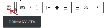
You can also toggle the button layout in either horizontal or vertical mode. Select the parent buttons block (select the button, and then select the parent block icon on the far left of the block toolbar). Then select “horizontal” or “vertical” from the variations menu in the block settings sidebar.
If it is crucial that a button opens its destination in a new tab, you can toggle that option in the Link settings panel by selecting an individual button in the Buttons block.
Floating Action Button
To enable the floating action button style:
- Select a Button block and then, in the block toolbar, select the parent Buttons block.
- In the Buttons block sidebar settings, locate the Positioning settings and toggle “Fixed position” on.
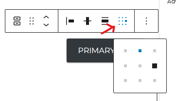
- Choose a position (top left, top center, etc.) using the “change content position” option in the Buttons block toolbar.
Note that the floating action button will overlap content, particularly on small screens. Test to make sure all of your content can still be accessed.
Examples
The filled button style is the primary button variety:
The outline style button is used for secondary intentions:
The text style button is used for alternate actions and will most often be paired with either the filled or outline style buttons.
A paired call-to-action (filled) and alternate (text) button:
Source
This is an HRS-created block provided as part of the HRSWP Blocks plugin.