Image
Image Blocks
Use standard image blocks to display individual images (with or without a caption) along with page content.
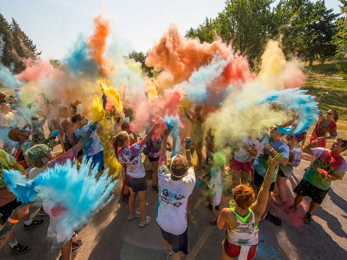
A default image block, with a large size image and no alignment:
When you select an image (either by upload or from the media library) you can change its size (thumbnail, small, medium, large, or full) and its alignment (none, left, right, center, wide, or full).
You can also modify the size to 25%, 50%, or 75% of the selected size but use this with caution. Always select the size from the “image size” menu that is closest to the size you need in order to guarantee pages load more quickly for site visitors.
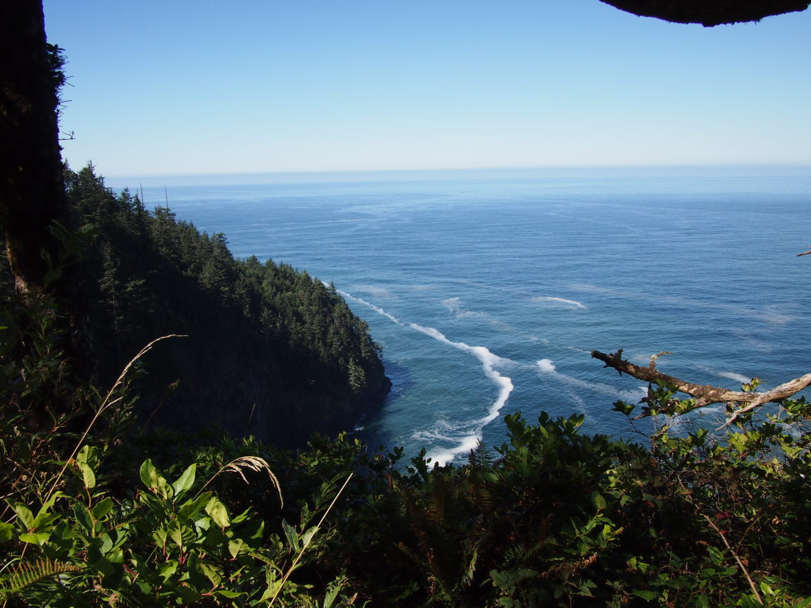
A centered image block, small size, with a caption:


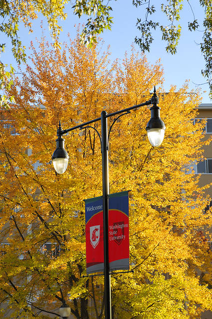
An image block with a thumbnail size image, right aligned.
You can also give an image rounded corners by selecting the Rounded style option in the settings sidebar. The following images have rounded corners.

Note that if you want a round image then the original image must be square, or you can use the thumbnail size.

An image block with a large size, set to align wide should expand to fill the full content area, while align full will do the same but without left and right margins.
Image Galleries
Image gallery blocks display a selection of multiple images in a flexible grid layout. You can select columns from 1 to the number of images in your gallery for the grid display (up to a max of 8 columns) and can select whether to crop them to equivalent sizes or leave them in their original aspect ratios.
The gallery block will try to fit images evenly in a grid, which may involve displaying some images spanning multiple columns.
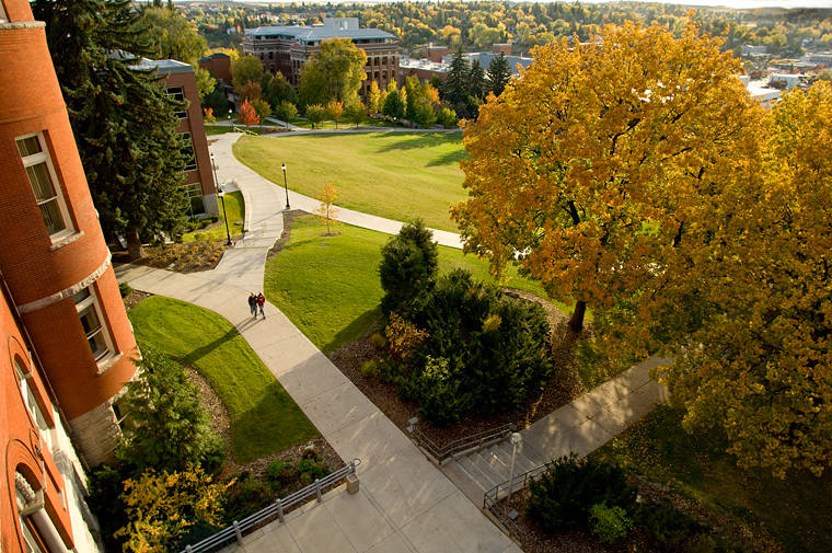
A gallery block with 7 images set to 5 columns, with cropped images and no alignment.


Like other image blocks, galleries can be aligned none, left, right, center, wide, or full). Aligning a gallery to the left or right will automatically restrict its max width.
A 3-image gallery block with 3 columns set to align right with un-cropped images.
A wide align image gallery block with 10 cropped images and 5 columns. Note that image captions will overlay on top of images in galleries.
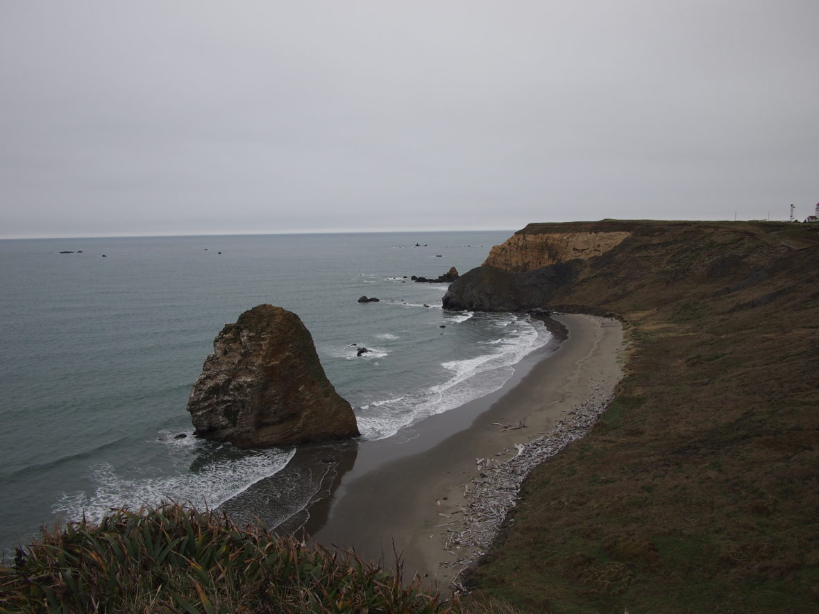
Image Sizing
WordPress automatically generates up to 4 versions of every uploaded image, plus the original, depending on the original image size:
- Thumbnail: square aspect ratio (150px × 150px).
- Small: original aspect ratio (350px × unlimited)
- Medium: original aspect ratio (width/height capped at 720px)
- Large: original aspect ratio (width/height capped at 1180px)
- Full: the original image
Only images that are at least 1180px wide or tall will produce all four variants alongside the original.
Source
These are WordPress-created core blocks that are built in to WordPress.